Friday 19 April 2013

Street Photography

What is Street Photography?
Street photography captures people and places within the public. 'It is defined by LFPH as "un-posed, un-staged photography which captures, explores or questions contemporary society and the relationships between individuals and their surroundings."' Even though this style of photography usually includes people, it does not need to. It can be more easily defined as a method than a genre of photography.

What is the decisive moment?
It's about capturing the moment. A moment before or after and this shot would not have had the same effect.

What do you think are the ethical considerations for Street Photography?
I'd be careful of capturing the faces of children and would take peoples privacy into consideration. Even though it may seem acceptable to photograph anything/anyone in the public view, you should still consider certain boundaries.

Do's
Preferably a small camera, such as a bridge camera or an SLR (shoot wide - 35mm and 50mm)
Know the laws
Be considerate and have good judgment/manners
Go to where the people are, where the action is (blend in)
Be curious
be subtle

Don'ts
Don't try too hard to blend in, dress as usual
Avoid being flashy with your gear
Don't stalk people or sneak up on them

MrEllis (James Ellis) Street Photography
http://www.flickr.com/photos/mrelllis/page2/
James Ellis' hometown is Toronto and currently lives in Canada. He posts all of his photography on Flickr and Tumblr, this way he receives emails of people interested in buying prints. Ellis made it into the 'Complex's 50 Greatest Street Photographers' as number 43. I am inspired by Ellis' street photography because his style is very real and creative. He captures moments and bright colours as well as black and white photo's which look just as effective. I really like his style and the eye he has for capturing his photo's.

The image above really captures individuality and reality. I like this photo because of the clear focus and depth of field. The focus is on the man in the center of the camera and with him looking in another direction to the lens it creates emotion.

I really love this photo because of the bright colours and the focus. With the lights not being in focus, it makes them brighter and shows off the effect of the rain a lot more. Also, the warm tones in this photo are complimentary.


These photos below are some that I took in London. They capture the every day life in the busy city and show different emotion. 


If I was to edit this photo, I would make the entire image black and white and leave the girl at the front of the image in colour because her dress is bright red. This would create a nice effect and the colour of her dress would be a bold focus which I think would look really good.


I took this image whilst we were walking towards Carnaby Street. It captures the every day business man next to a underground entrance. 


I took this photo because it shows the tourists amongst the business men. I edited it in Photoshop by making the tourists stand out more and blurred the background of the 2 tourists and 2 business men to make them the focus of the image. 

I really like this photo because it's almost like a decisive moment. I edited it in Photoshop because I thought it would look better if the building in the background was cropped out so that the rule of thirds could be applied. I also enhanced the brightness to make it more effective.

I couldn't decide which edit I preferred, colour or black and white. So this is the other version which is more bold by being in black and white.

Wednesday 27 February 2013

Assignment Two

Lighting
Photographers have four main considerations for light:

  1. Quantity - how much light (bright, dim, faint, etc)
  2. Quality - soft light or a harsh hard light giving crisp dark shadows
  3. Direction - where is the light coming from?
  4. Colour - the colour of 'hue' of the light
Hard light produces crisp dark shadows with high contrast, whereas soft light produces gentle mid-tone shadows of low contrast. The hard light has a higher contrast which makes the picture much  brighter with harsher shadows, it also emphasizes surface texture. By use a soft light, you are able to see the outline.


I took this image of a dead rose because I really liked the colours that had developed on the flower.  The light was shining directly onto the flower which created the crisp dark shadow behind it on the wall. My camera was on automatic as it focused on the head of the flower straight away and slightly blurred the stem/leaf. I think this photo would look better if i enhanced the contrast so that the colours could be brighter to have a better effect.
This photo also shows elements of negative space because the object (the rose) is on the left side of the photo.

White balance is a control/system for adjusting the colour balance. Most cameras have a white balance function, the difference settings include:

  1. Auto white balance
  2. Bright, sunny day (daylight) - warm tones
  3. Cloudy - warm tones
  4. Shade - warm tones
  5. Tungsten - cool tones
  6. Fluorescent - warm 'red' tones
  7. Flash - warm tones
  8. Custom

I took this photo using the 'Bright, sunny day' white balance on my camera. I chose to use this white balance because it gave the image a warm tone and enhanced the whiteness of the old-fashioned furniture.  The structure of the photo is quite delicate and the scenery behind the furniture is a lot darker to help make the main focus of the photograph be the key point.

To take this photo, put the Flash on auto so that it would capture  more detail. This photo was taken very early in the morning so it was still quite dark outside, that made me want to take the picture because using a flash would make the contrast of the photo dark in the background and brighter for the focus. Also, to create the element of depth of field, i focused on a part of the door handle and then zoomed out so the rest was not in focus. I think this makes a good effect on the image.

Composition
The term 'composition' means the arrange of elements in a shot which make it interesting to look at.

The Rule of Thirds is a way to balance the picture and give you interesting shots. The points where the lines cross each other are the strongest focal points. The lines themselves are the second strongest focal points. The theory of the Rule of Thirds is if you place the interesting points of your shot at the points where the lines cross or along the lines themselves - your photo becomes more balanced and interesting.

This photo uses the rule of thirds by the main focus being my guinea pig in the center of the picture where the grid lines  (focal lines) would cross. For this photo, i used the 'creative auto' setting on my camera and chose 'warm', (flash was also applied), by doing this it created a better blur in the background and make the colours stand out more.
Where the focal lines are placed on a picture, it shows what section of the image our eyes are more drawn to.

The Rule of Even and Odd
An even number of 'things' in an image can sometimes create a feeling of tension or a slightly un-natural look, while an odd number of 'things' can often create a feeling of harmony or balance


The Rule of Triangles
Triangles have 3 sides and tend to form stable, solid looking compositions.

I took this photo as an example of The Rule of Triangles as it shows the formation and structure  clearly. The different heights of all 3 girls show the outline of the 'triangle' with the tallest being in the middle. This balances out the image.


Rule of Space
Negative space is the space around and between the subjects of an image. Filling up an image with information and detail can often create confusion and look messy. Using 'negative space' can be dramatic and very effective.

I really like this photo for the use of negative space because it's a clear blue sky in the background and everything is in focus. The stones were in the photo at the bottom so i cropped them out to make it more simple. Also, the colours don't clash.


Symmetry
Symmetry is a way to balance an image. It can often create a bigger imae when used in a confined space which is very effective.


I did not use flash to take this photo because otherwise there would have been a dark shadow and that would not be symmetrical. 


Depth of Field
Depth of Field is the difference between the nearest and the furthest objects that give an image judged to be in focus in a camera. There are 3 things which can change the depth of field:

  1. the aperture
  2. the focal length of lens used
  3. how near the subject focused on is to the camera
Aperture is measured in F numbers (larger the F number, the smaller the aperture but more will be in focus)

To take this photo, i used the 'Daylight' white balance setting to create the depth of field and brightness of the photo.


Portrait Photography
Portrait photography is used to capture a persons likeness. The main focus is the face and eyes and can be taken of both groups and individuals.
Digital photography is not as hazardous as film photography as there is no need to handle chemicals in a darkroom. However, it is not without its hazards. Here is a table to explain a few of the hazards and solutions for health ans safety in photography.

Hazard - Solution
Wires/poles - Make sure the wires are taped to the floor to prevent tripping over them
Backdrop screen - Be aware and sensible with the backdrop screen as it could be a tripping hazard
Bright lights - Don't look directly at the bulb because it'll hurt and damage your eye sight

Studio lighting includes 4 different pieces of equipment:

  1. Key Light - the main source of light
  2. Fill Light - fills the shadows created by the key light
  3. Hair Light - illuminate the hair to make it look more 3D
  4. Umbrella - Diffusing light (white) & Reflecting/bouncing light (black)


Photoshop is the digital photographers 'darkroom'. It gives you a world of possibilities with your images. From making minor adjustments with contrast or cropping to creating dramatic colour enhancements, it has become a valuable piece of software for media organisations across the world.

(cropping - changing colour, adjusting levels - colour balance)


Friday 15 February 2013

Subject Terminology

Hard light - Produces crisp dark shadows with high contrast

Soft light - Produces gentle mid-tone shadows of low contrast

Colour connotation - The feeling a colour gives us

Symmetry - A way to balance an image

Composition - The arrangement of elements in a shot which make it interesting to look at

Key light - Main source of light

Umbrella flash - Diffusing light (white), reflecting/bouncing light (black)

Rule of Thirds - A way to balance the picture and give you interesting shots

Photoshop - Digital photographers 'darkroom', being able to adjust and adapt photos

DPI - Dots per inch, a measure of the resolution of printers, scanners, etc

Unconstrained - You can have it any resolution size you want

JPEG - A format fr compressing images

Contrast - Difference between the lights and darks of an image

Depth of field - The difference between the nearest and the furthest objects that give an image judged to be in focus in a camera.
There are 3 things which can change the depth of field:

  1. the aperture
  2. the focal length of lens used
  3. how near the subject focused on is to the camera
  4. aperture is measured in F numbers. (larger the F number, 
White balance - A control or system for adjusting the colour balance

Negative space - The space around and between the subjects of an image

Abstract - No structure, more creative and imaginative elements

Representational - Representing an image with feeling and representing another image (how an image portrays a person and the feeling)

Exposure - The amount of light that goes onto the sensor for area unit

Histogram - Measures the amount of light and darkness in an image and allows you to change it

Friday 25 January 2013

Photoshop in photography

Photoshop is the digital photographers 'darkroom'! It gives you a world of possibilities with your images, From making minor adjustments with contrast or cropping to creating dramatic colour enhancements, it has become a valuable piece of software for media organisations across the world.

How do you open a file in Photoshop?
You click 'File' and then click 'Open..' in the drop down bar

How do you crop the image?
On the tool bar to the far left of the screen, there is a 'Crop Tool' which is the forth one from the top. You click that to highlight the area you want to crop and press the 'Enter' key to select it

What is the difference between orignial Ratio and Unconstrained?
Original Ratio is determined by the camera what resolution it would be and what the size will be

How do you turn an image into black and white?
To turn an image into black and white, you select 'Image' at the top near 'File' and then click 'Adjustments..' in the drop down bar, which will then show another drop down bar with different effect options. You click 'Black & White'. For a shortcut, you can press on the keyboard 'Alt+Sift+Ctrl+B'

What is a JPEG?
A JPEG is a format for compressing images

What is resolution?
An image resolution describes the detail an image holds. This applies to digital images, film images, and other types of images. For instance, the higher the resolution, the more detail in an image

LEVELS
Getting the levels right on your photographs can make the difference between a bland shot and a dynamic one!

Where do you find levels on Photoshop?
You go to 'Image' and then click 'Adjustments..' in the drop down bar. It'll then show another drop down bar where you can select 'Levels'

What is a histogram?
A histogram measure the amount of light and darkness in an image and allows you to change it. You can also use a tool effect called 'Curves'.


original


sepia

sepia


black and white

Friday 7 December 2012

The Rule of Even and Odd

Symmetry

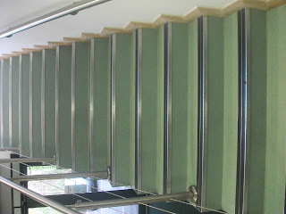
This image shows the repetition and pattern composition element. This is when something is repeated so that it can create a visual pattern. Pattern can be used to suggest texture, or can produce an abstract visual experience.

This image shows an element of symmetry. Using symmetry is a way to balance an image.

Pattern & Repetition

Pattern & Repetition

Friday 23 November 2012

White Balance

Daylight (warm tones)


Tungsten (cool tones)


Fluorescent (warm -red- tones)